# Load numpy, pandas and matplotlib (with aliases np, pd and plt respectively)
%matplotlib inline
import numpy as np
import pandas as pd
import matplotlib.pyplot as pltNotebook 3 : Unsupervised learning
Notebook prepared by Chloé-Agathe Azencott, modified by Victor Laigle.
In this notebook we will explore several techniques for dimension reduction and clustering.
plt.rc('font', **{'size': 12}) # set the global font size for plots (in pt)1. Principal Components Analysis (PCA)
In this section, we are going to perform a principal component analysis on a dataset describing the scores obtained by the best athletes who participated in a decathlon event in 2004, at the Athens Olympic Games or at the Talence Decastar.
Data loading
The data are contained in the decathlon.txt file.
The file contains 42 rows and 13 columns.
The first line is a header that describes the contents of the columns.
The following lines describe the 41 athletes.
The first 10 columns contain the scores obtained in the different events of the Decathlon. The 11th column contains the ranking. The 12th column contains the number of points obtained. The 13th column contains a categorical variable that specifies the competition concerned (Olympics or Decastar).
We will start by downloading the data from the github repository to your current working directory, and load the data into a pandas dataframe.
If you already downloaded the data, you can use the alternative suggested in the next cell.
!wget https://raw.githubusercontent.com/CBIO-mines/fml-dassault-systems/main/data/decathlon.txt

my_data = pd.read_csv('decathlon.txt', sep="\t")
--2026-05-13 09:40:26-- https://raw.githubusercontent.com/CBIO-mines/fml-dassault-systems/main/data/decathlon.txt
Resolving raw.githubusercontent.com (raw.githubusercontent.com)... 185.199.108.133, 185.199.109.133, 185.199.110.133, ...
Connecting to raw.githubusercontent.com (raw.githubusercontent.com)|185.199.108.133|:443... connected.
HTTP request sent, awaiting response... 200 OK
Length: 3579 (3.5K) [text/plain]
Saving to: ‘decathlon.txt.1’
decathlon.txt.1 0%[ ] 0 --.-KB/s
decathlon.txt.1 100%[===================>] 3.50K --.-KB/s in 0s
2026-05-13 09:40:26 (56.8 MB/s) - ‘decathlon.txt.1’ saved [3579/3579]
Alternatively: If you’re not on Colab and have already downloaded the file to a data folder, uncomment and run the following cell:
# my_data = pd.read_csv('data/decathlon.txt', sep="\t") # Read the data into a dataframemy_data.head()| 100m | Long.jump | Shot.put | High.jump | 400m | 110m.hurdle | Discus | Pole.vault | Javeline | 1500m | Rank | Points | Competition | |
|---|---|---|---|---|---|---|---|---|---|---|---|---|---|
| SEBRLE | 11.04 | 7.58 | 14.83 | 2.07 | 49.81 | 14.69 | 43.75 | 5.02 | 63.19 | 291.7 | 1 | 8217 | Decastar |
| CLAY | 10.76 | 7.40 | 14.26 | 1.86 | 49.37 | 14.05 | 50.72 | 4.92 | 60.15 | 301.5 | 2 | 8122 | Decastar |
| KARPOV | 11.02 | 7.30 | 14.77 | 2.04 | 48.37 | 14.09 | 48.95 | 4.92 | 50.31 | 300.2 | 3 | 8099 | Decastar |
| BERNARD | 11.02 | 7.23 | 14.25 | 1.92 | 48.93 | 14.99 | 40.87 | 5.32 | 62.77 | 280.1 | 4 | 8067 | Decastar |
| YURKOV | 11.34 | 7.09 | 15.19 | 2.10 | 50.42 | 15.31 | 46.26 | 4.72 | 63.44 | 276.4 | 5 | 8036 | Decastar |
Visualization
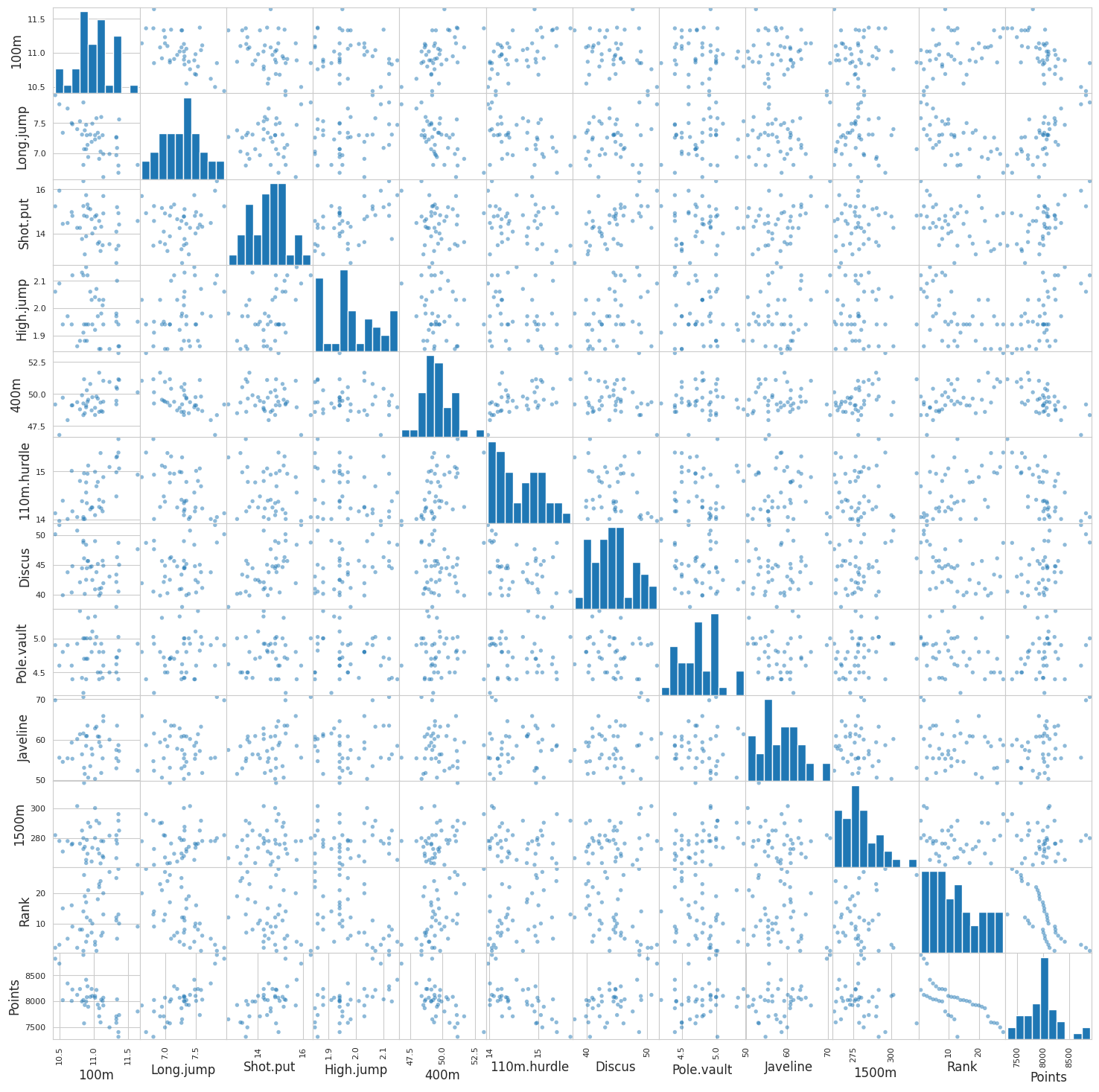
A scatter matrix is a visualisation, in k x k panels, of the pairwise relations between k variables:
- on the diagonal, the histogram of each variable
- off-diagonal, the scatter plots between two variables (non standardized)
Your job here is to display the visualization with the scatter_matrix function:
from pandas.plotting import scatter_matrix

### START OF YOUR CODE

scatter_matrix(my_data, s=60, figsize=(18, 18));

### END OF YOUR CODE
NoteClick for figure
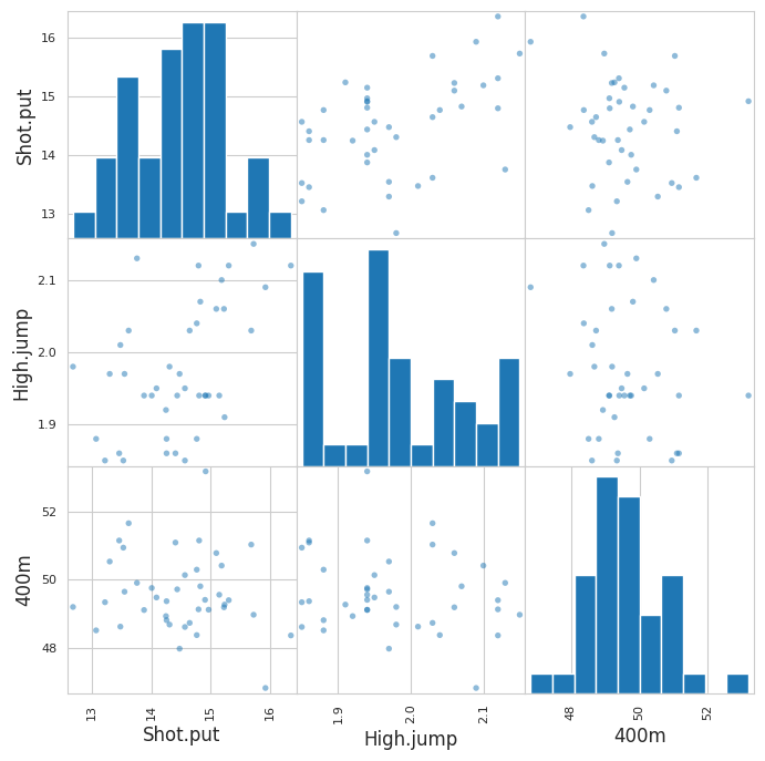
You can also limit the visualization to a few variables for clearer observations. Display the scatter_matrix for the 3 or 4 variables which seem most correlated for example:
### START OF YOUR CODE

scatter_matrix(my_data[['Shot.put', 'High.jump', '400m']],
               alpha=0.5, s=60, figsize=(8, 8));

### END OF YOUR CODE
NoteClick for figure
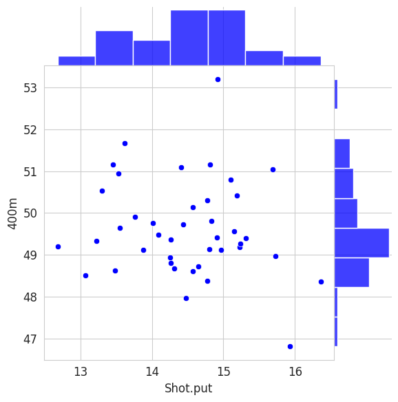
Alternatively, the seaborn library la librairie seaborn enables more elaborated visualizations than matplotlib. You can explore, for instance, the capabilities of jointplot.
import seaborn as sns
sns.set_style('whitegrid')

sns.jointplot(x='Shot.put', y='400m', data = my_data,
              height=6, space=0, color='b')

sns.jointplot(x='Rank', y='Points', data = my_data,
              kind='reg', height=6, space=0, color='b');
NoteClick for figure
![]()
We will now perform a principal components analysis of the scores in the 10 events.
Let’s start by extracting the predictive variables
X = np.array(my_data.drop(columns=['Points', 'Rank', 'Competition']))
print(X.shape)
(41, 10)Data standardization
After visualizing the data, we can notice different data scales and distributions depending on the variables. We therefore reapply the procedure seen in previous labs to standardize our data: we need a StandardScaler object contained in the preprocessing module of sklearn.
### START OF YOUR CODE

# Import the module
from sklearn import preprocessing
# Create the StandardScaler object
std_scaler = preprocessing.StandardScaler()
# Fit the object to the data
std_scaler.fit(X)
# Transform the data
X_scaled = std_scaler.transform(X)
### END OF YOUR CODE
print(X_scaled.shape)(41, 10)Computation of the principal components
scikit-learn’s algorithms for matrix factorization are included in the decomposition module. For PCA, refer to: https://scikit-learn.org/stable/modules/generated/sklearn.decomposition.PCA.html
from sklearn import decompositionNote: We have few variables here so we can afford to calculate all the PCs.
As we’ve seen in previous labs, most algorithms implemented in scikit-learn work as follows:
- we instantiate an object, corresponding to a type of algorithm/model, with its hyperparameters (here the number of components)
- we use the
fitmethod to pass the data to this algorithm - the learned parameters are now accessible as attributes of this object
# Instantiation of a PCA object with 10 principal components

### START OF YOUR CODE
pca = decomposition.PCA(n_components=10)
# We now pass the standardized data to this object
# This is where the computations are performed
pca.fit(X_scaled)
### END OF YOUR CODEPCA(n_components=10)In a Jupyter environment, please rerun this cell to show the HTML representation or trust the notebook.
On GitHub, the HTML representation is unable to render, please try loading this page with nbviewer.org.
PCA(n_components=10)
Proportion of variance explained by the PCs
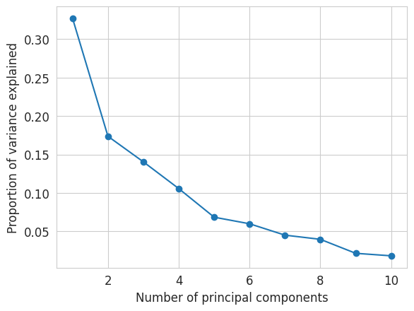
We will now plot the proportion of variance explained by the different components. This is accessible in the attribute explained_variance_ratio_ of our pca object.
plt.plot(np.arange(1, 11), pca.explained_variance_ratio_, marker='o')

plt.xlabel("Number of principal components")
plt.ylabel("Proportion of variance explained")
plt.show()
NoteClick for figure
We can also display the cumulative proportion of variance explained, with the function cumsum from numpy (imported above under the alias np)
Create a similar graph to the one just above, displaying the cumulative proportion of variance explained as a function of the number of principal components considered.
### START OF YOUR CODE

plt.plot(np.arange(1, 11), np.cumsum(pca.explained_variance_ratio_), marker='o')

plt.xlabel("Number of principal components")
plt.title("Cumulative proportion of variance explained")
plt.show()

### END OF YOUR CODE
NoteClick for figure
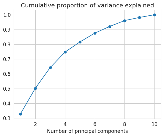
Questions:
- What is the proportion of variance explained by the first two components ?
- How many components would we need to use to explain 80% of the data’s variance ?
Data projection on the first two principal components
We will now use only the first two principal components.
Let’s start by computing the new data representation, i.e. their projection on these two PCs.
X_projected = pca.transform(X_scaled)
print(X_projected.shape)
(41, 10)We can display a scatter plot representing the data along these two PCs.
fig = plt.figure(figsize=(5, 5))

plt.scatter(X_projected[:, 0], X_projected[:, 1])

plt.xlabel("PC 1")
plt.ylabel("PC 2")
plt.show()
NoteClick for figure
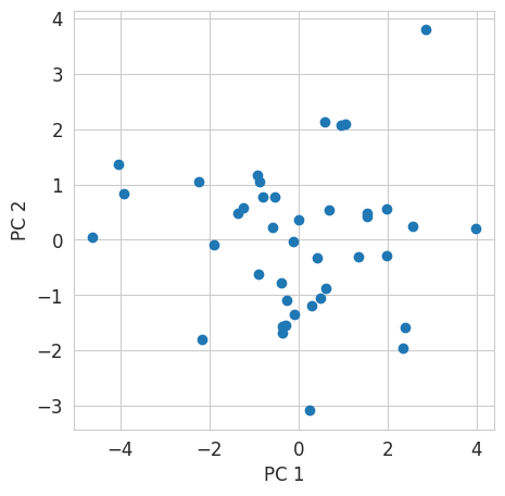
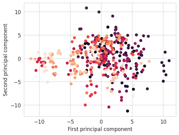
We can now color each point of the above scatter plot according to the ranking of the athlete it represents.
fig = plt.figure(figsize=(5, 5))

plt.scatter(X_projected[:, 0], X_projected[:, 1], c=my_data['Rank'])

plt.xlabel("PC 1")
plt.ylabel("PC 2")
plt.colorbar(label='Rank')
plt.show()
NoteClick for figure
![]()
Question: What can we conclude about the interpretation of PC1 ?
Interpretation of the first two principal components
Each principal component is a linear combination of the variables describing the data. The weights of this linear combination are accessible in pca.components_.
We can now visualize, not the individuals as above, but the 10 variables in the space of the 2 PCs.
pcs = pca.components_
print(pcs[0])
[ 0.42829627 -0.41015201 -0.34414444 -0.31619436 0.3757157 0.41255442
-0.30542571 -0.02783081 -0.15319802 0.03210733]fig = plt.figure(figsize=(6, 6))
plt.scatter(pcs[0], pcs[1])
for (x_coordinate, y_coordinate, feature_name) in zip(pcs[0], pcs[1], my_data.columns[:10]):
plt.text(x_coordinate + 0.01, y_coordinate + 0.01, feature_name)
plt.xlabel("Contribution to PC1")
plt.ylabel("Contribution to PC2")
plt.show()
NoteClick for figure
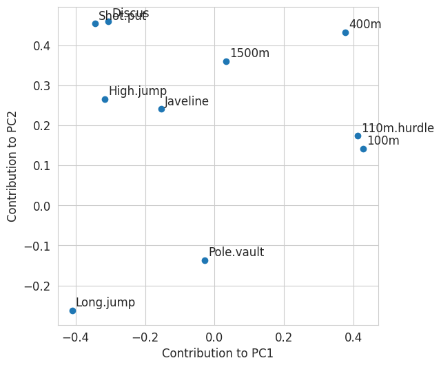
Questions:
- Which variables have contributions very similar to the two principal components ?
- What can we deduce from their similarity ?
- How to interpret the sign of the variables’ contributions to the first principal component ?
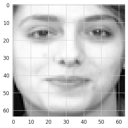
2. « Olivetti » data
We will now use dimension reduction to represent, in two dimensions, a dataset of human faces. This is a classic dataset, containing 400 pictures of 64 by 64 pixels. These are pictures of the face of 40 different people, 10 pictures per person, labeled by a class number between 0 and 39 to identify the person.
We can load this dataset directly thanks to scikit-learn:
from sklearn import datasetsdata = datasets.fetch_olivetti_faces()If you do not manage to download the data:
- Go to : https://github.com/CroncLee/PCA-face-recognition/blob/master/olivetti_py3.pkz
- Download the file (there is a Download button)
- Use the command
data = datasets.fetch_olivetti_faces(data_home="<PATH TO DATA>")Replace “PATH TO DATA” by the path of the folder where you saved the data.
X = data.data
y = data.targetprint(X.shape)(400, 4096)print("The dataset contains %d classes" % len(np.unique(y)))The dataset contains 40 classesEach image is represented by one value for each pixel (grey scale).
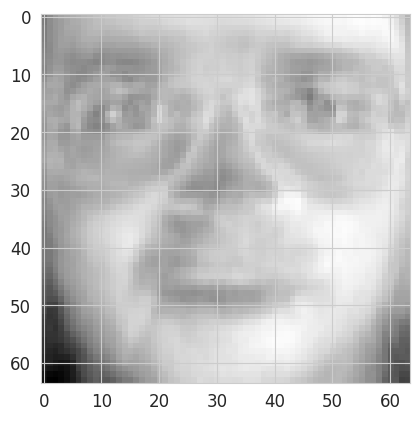
We may visualize these images, under the condition that we reorganize the values (= a vector of length 4096) in 64x64 matrices. For example, for image with index 77:
plt.imshow(X[77, :].reshape((64, 64)), interpolation='nearest', cmap=plt.cm.gray);
NoteClick for figure
PCA
Let’s start with a principal components analysis as in the previous section:
pca = decomposition.PCA(n_components=2)
X_transformed_pca = pca.fit_transform(X)
Each picture is now represented, not by 4096 variables, but by 2 variables. We can visualize them on a scatter plot and color them according to their class:
plt.scatter(X_transformed_pca[:, 0], X_transformed_pca[:, 1], c=y)
plt.xlabel("First principal component")
plt.ylabel("Second principal component")
plt.show()
NoteClick for figure
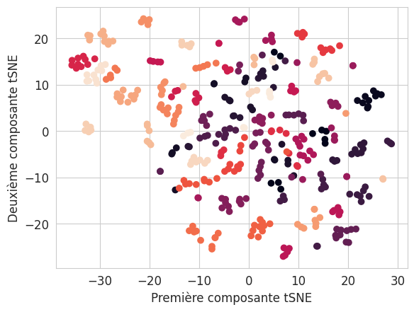
Question: Do pictures of the same face (= same class) have close or far apart representations ?
We can visualize the contribution of each pixel to the first principal component:
plt.imshow(pca.components_[0, :].reshape((64,64)), interpolation='nearest', cmap=plt.cm.gray);
NoteClick for figure
And the contribution of each pixel to the second principal component:
plt.imshow(pca.components_[1, :].reshape((64,64)), interpolation='nearest', cmap=plt.cm.gray);
NoteClick for figure
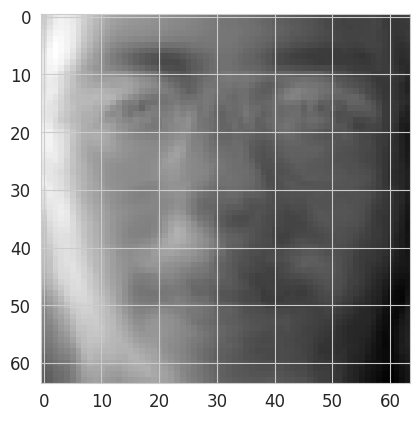
Question: Which interpretation can we draw from these two images representing the contributions of each pixel to the first two principal components ?
tSNE
Let’s try another dimension reduction method to better separate our classes.
We will use the same approach as for PCA, but with the tSNE algorithm, thanks to the TSNE class of the manifold module.
Now it’s your turn to:
- create the
tsneobject from the class cited above. Here we want to reduce our dataset to two dimensions in order to visualize it. - assign the information of our dataset to this object
- transform our data to obtain new coordinates in two dimensions
from sklearn import manifold### START OF YOUR CODE
tsne = manifold.TSNE(n_components=2, init='random', learning_rate='auto')
X_transformed = tsne.fit_transform(X)
### END OF YOUR CODELet’s display the result of the tSNE dimension reduction:
plt.scatter(X_transformed[:, 0], X_transformed[:, 1], c=y)
plt.xlabel("Première composante tSNE")
plt.ylabel("Deuxième composante tSNE");
NoteClick for figure
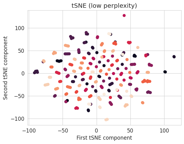
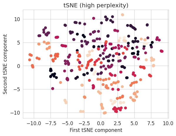
Influence of the perplexity parameter
The main hyperparameter influencing the representation obtained by the tSNE algorithm is the “perplexity” parameter. This represents the number of neighbours for which distances are preserved. It therefore influences the preservation of the local structure (low perplexity) or global structure (high perplexity). The representation obtained can vary greatly depending on this parameter.
Test different values of the perplexity parameter and display the corresponding results.
### START OF YOUR CODE

tsne_low_perp = manifold.TSNE(n_components=2, init='random', learning_rate='auto', perplexity=1)
X_transformed_low_perp = tsne_low_perp.fit_transform(X)

### END OF YOUR CODE
plt.scatter(X_transformed_low_perp[:, 0], X_transformed_low_perp[:, 1], c=y)
plt.xlabel("First tSNE component")
plt.ylabel("Second tSNE component")
plt.title("tSNE (low perplexity)");
NoteClick for figure
### START OF YOUR CODE

tsne_high_perp = manifold.TSNE(n_components=2, init='random', learning_rate='auto', perplexity=100)
X_transformed_high_perp = tsne_high_perp.fit_transform(X)

### END OF YOUR CODE
plt.scatter(X_transformed_high_perp[:, 0], X_transformed_high_perp[:, 1], c=y)
plt.xlabel("First tSNE component")
plt.ylabel("Second tSNE component")
plt.title("tSNE (high perplexity)");
NoteClick for figure
3. Clustering
We will now cover another set of unsupervised methods, used to group observations according to their similarities.
We’ll start by generating three two-dimensional datasets:
- 4 separated blobs from normal distributions
- 2 nested semi-circles (or “semi-moons”)
- 2 concentric circles
from sklearn import datasets# nombre de points
n_samples = 1000
four_blobs, four_blobs_labels = datasets.make_blobs(n_samples=n_samples, centers=4, n_features=2, random_state=170)
moons, moons_labels = datasets.make_moons(n_samples=n_samples, noise=0.05, random_state=170)
circles, circles_labels = datasets.make_circles(n_samples=n_samples, factor=.5, noise=.05, random_state=170)First, let’s visualize these data:
fig, ax = plt.subplots(1, 3, figsize=(10, 3))

ax[0].scatter(four_blobs[:, 0], four_blobs[:, 1], c=four_blobs_labels, s=20, alpha=0.7, cmap='viridis')
ax[1].scatter(moons[:, 0], moons[:, 1], c=moons_labels, s=20, alpha=0.7, cmap='viridis')
ax[2].scatter(circles[:, 0], circles[:, 1], c=circles_labels, s=20, alpha=0.7, cmap='viridis')

ax[0].set_title('4 blobs')
ax[1].set_title('Moons')
ax[2].set_title('Circles');
NoteClick for figure
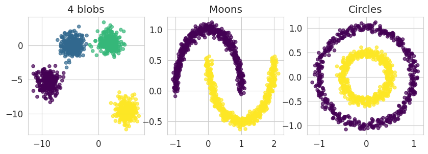
Now, let’s assume that we do not have access to the labels. Which clustering algorithms allow us to recover the clusters corresponding respectively to the four blobs, two moons and two circles ?
K-means algorithm
The objective of the k-means algorithm is to find \(K\) clusters (and their centroid \(\mu_k\)) so as to minimize the intra-cluster variance:
\[\begin{align} V = \sum_{k = 1}^{K} \sum_{x \in C_k} \frac{1}{|C_k|} (\|x - \mu_k\|^2) \end{align}\]
Manual implementation
We’ll start by implementing the algorithm “by hand”, step by step, to fully understand and visualize what the algorithm does. We will then see how to use directly the K-means implementation in the sklearn library. The different steps of the algorithm are:
- Select the number
kof clusters (hyperparameter) - Initialize the
kcentroids at random among our data points - Compute the distances from all data points to these centroids
- Assign each point to the cluster of the closest centroid
- Compute the position of the new centroids
- Repeat steps 3 to 5 until convergence, i.e. until the centroids no longer change from one iteration to the next
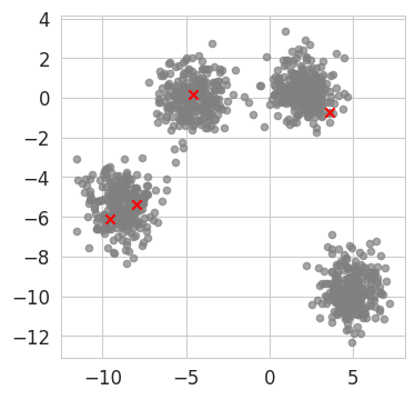
We will implement this algorithm on the 4 blobs dataset, starting with the choice of k and with the random selection of k points from our dataset that will constitute the initial centroids:
np.random.seed(23)  # set seed. Important for k-means step by step visualisation. With other seeds, it's not as clear how the algorithm works.

k = 4
random_indices = np.random.choice(len(four_blobs), k, replace=False)
centroids_step0 = four_blobs[random_indices]

for i, centroid in enumerate(centroids_step0):
    print(f"Centroid {i} : x = {centroid[0]},\ty = {centroid[1]}")
Centroid 0 : x = 3.5679755708830445, y = -0.7411643083568404
Centroid 1 : x = -4.58197076050192, y = 0.1707016264777655
Centroid 2 : x = -9.582073371322199, y = -6.079460047487451
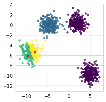
Centroid 3 : x = -7.990366325280352, y = -5.347131046114068Let’s look at the data with these initial centroids (red crosses)
fig, ax = plt.subplots(1, 1, figsize=(4, 4))

ax.scatter(four_blobs[:, 0], four_blobs[:, 1], c='grey', s=20, alpha=0.7)
ax.scatter(centroids_step0[:, 0], centroids_step0[:, 1], c='red', marker='x')

plt.show()
NoteClick for figure
We can now compute the distances between each data point and these centroids
# Euclidean distance between data point and centroid
def compute_distance(data_point, centroid):
    dist = np.sqrt(np.sum((data_point - centroid)**2))
    return dist

def compute_all_distances(dataset, centroids):
    # Initialize distances array
    distances = np.zeros((k, n_samples))  # k and n_samples defined above

    # Calculate distance from each point to each centroid
    for i in range(k):
        for j in range(n_samples):
            distances[i, j] = compute_distance(dataset[j], centroids[i])

    return distances
distances = compute_all_distances(four_blobs, centroids_step0)
# Example of distances for the first 5 points to the k centroids
print("Distances :")
print("\t\t", " \t\t".join([f"Point {i+1}" for i in range(5)]))
for i in range(k):
print(f"Centroid {i}\t", "\t".join(distances[i, :5].astype(str).tolist()))Distances :
Point 1 Point 2 Point 3 Point 4 Point 5
Centroid 0 11.784247411011116 14.758813013069012 9.466528460382866 9.451368197501498 13.843809467072518
Centroid 1 5.758643667904218 8.776449714052207 14.254003753639761 13.797528285545447 7.706191288891633
Centroid 2 2.448740366311389 0.8050123894604602 15.465578634003116 14.741265477233672 0.34858815305556784
Centroid 3 0.7400184315424295 2.3987055841506097 14.158075744365863 13.461171066113893 1.4045646722216132We now assign to each point the cluster corresponding to the closest centroid. We use the argmin function from numpy for that. In a way it can be seen as intermediate predicted labels.
def assign_cluster(distances):
    assignments = np.argmin(distances, axis=0)
    return assignments

intermediate_labels = assign_cluster(distances)
print(intermediate_labels[:5])  # examples of intermediate labels assigned to the data points
[3 2 0 0 2]We can verify that the intermediate labels assigned indeed correspond to the closest centroid by comparing with the distances calculated above (see previous cell).
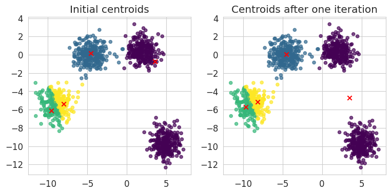
Let’s visualize these intermediate clusters and the initial centroids on a scatter plot
def visualise_kmeans(dataset, labels, centroids, ax):

    ax.scatter(dataset[:, 0], dataset[:, 1], c=labels, s=20, alpha=0.7, cmap='viridis')
    ax.scatter(centroids[:, 0], centroids[:, 1], c='red', marker='x')

fig, ax = plt.subplots(1, 1, figsize=(4, 4))
visualise_kmeans(four_blobs, intermediate_labels, centroids_step0, ax)
plt.show()
NoteClick for figure
We now need to compute the position of the new centroids, which we will plot on a new graph
def compute_new_centroids(dataset, labels):
    centroids = np.zeros((k, dataset.shape[1]))

    for i in range(k):
        centroids[i] = dataset[labels == i].mean(axis=0)

    return centroids

centroids_step1 = compute_new_centroids(four_blobs, intermediate_labels)

fig, axes = plt.subplots(1, 2, figsize=(9, 4))
visualise_kmeans(four_blobs, intermediate_labels, centroids_step0, axes[0])
visualise_kmeans(four_blobs, intermediate_labels, centroids_step1, axes[1])

axes[0].set_title("Initial centroids")
axes[1].set_title("Centroids after one iteration")

plt.show()
NoteClick for figure
We now repeat the different steps:
- computation of distances to centroids,
- assignment of clusters to data points,
- computation of new centroids
fig, axes = plt.subplots(1, 5, figsize=(24, 4))
n_iter = 10  # Number of iterations of the algorithm

current_fig = 0

centroids = centroids_step1
for i in range(n_iter):

    distances = compute_all_distances(four_blobs, centroids)
    intermediate_labels = assign_cluster(distances)

    # We display the visualization every 2 iterations
    if (i+1) % 2 == 0:
        visualise_kmeans(four_blobs, intermediate_labels, centroids, axes[current_fig])
        axes[current_fig].set_title(f"Iteration {i+1}")
        current_fig += 1

    centroids = compute_new_centroids(four_blobs, intermediate_labels)

plt.show()
NoteClick for figure
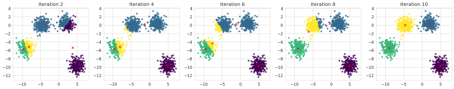
We clearly see here how, through successive iterations, the algorithm is able to correctly identify our clusters, gradually moving the centroids and readjusting the clusters’ membership of our data points.
Question: In which case(s) can the algorithm yield bad results ?
Implementation with sklearn
Let’s come back to the 3 datasets created earlier (4 blobs, semi-moons and concentric circles), and apply the to them the sklearn implementation of the K-means algorithm, which is an optimized version of the steps we have just seen.
Documentation : https://scikit-learn.org/stable/modules/generated/sklearn.cluster.KMeans.html
from sklearn import cluster# START OF YOUR CODE
# Instantiation of the three k-means models with the
# theoretical number of clusters (resp. 4, 2 and 2):
kmeans_four_blobs = cluster.KMeans(n_clusters=4)
kmeans_moons = cluster.KMeans(n_clusters=2)
kmeans_circles = cluster.KMeans(n_clusters=2)
# Application to the data
kmeans_four_blobs.fit(four_blobs)
kmeans_moons.fit(moons)
kmeans_circles.fit(circles)
### END OF YOUR CODEKMeans(n_clusters=2)In a Jupyter environment, please rerun this cell to show the HTML representation or trust the notebook.
On GitHub, the HTML representation is unable to render, please try loading this page with nbviewer.org.
KMeans(n_clusters=2)
The .labels_ attribute contains, for each observation, the number of the cluster to which this observation has been assigned.
kmeans_four_blobs.labels_[0:10] # Example of predicted labels for the first 10 data pointsarray([1, 1, 0, 0, 1, 2, 0, 3, 2, 0], dtype=int32)Let’s visualize what the final clustering looks like for our three datasets:
# Clustering visualization
fig, ax = plt.subplots(1, 3, figsize=(10, 3))

ax[0].scatter(four_blobs[:, 0], four_blobs[:, 1], c=kmeans_four_blobs.labels_, cmap='viridis')
ax[1].scatter(moons[:, 0], moons[:, 1], c=kmeans_moons.labels_, cmap='viridis')
ax[2].scatter(circles[:, 0], circles[:, 1], c=kmeans_circles.labels_, cmap='viridis')

ax[0].set_title('4 blobs (k=4)')
ax[1].set_title('Moons (k=2)')
ax[2].set_title('Circles (k=2)');
NoteClick for figure
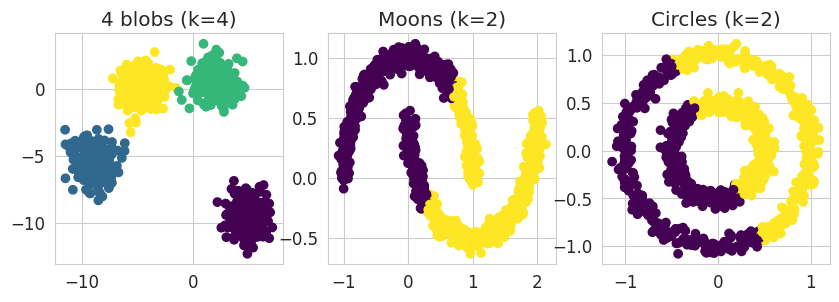
Questions:
- Is it the expected clustering ?
- In which case(s) does the k-means algorithm work correctly ?
- Why doesn’t it work in the other case(s) ?
Finding \(K\) with the silhouette coefficient
It is often the case that the exact number of clusters, \(K\), is not known in advance. We can still apply the k-means algorithm and measure the clustering performance to find the best parameter \(K\). One of the metrics used is the silhouette coefficient.
The silhouette coefficient (or score) enables to compare the average intra- and inter-cluster distances:
\[\begin{align} \text{score} = \frac{b - a}{\max(a, b)} \end{align}\]
with (for each sample):
- \(a\) the average intra-cluster distance
- \(b\) the average nearest-cluster distance
The score is computed for each observation (with a value between -1 (worst) and 1 (best)), then the average score enables to assess the clustering on the whole point cloud at once.
Documentation: https://scikit-learn.org/stable/modules/generated/sklearn.metrics.silhouette_score.html#sklearn.metrics.silhouette_score
from sklearn import metricsprint(f"4 blobs: Silhouette coefficient for k-means (k=4) : %.2f" %
metrics.silhouette_score(four_blobs, kmeans_four_blobs.labels_))
print(f"Moons: Silhouette coefficient for k-means (k=2) : %.2f" %
metrics.silhouette_score(moons, kmeans_moons.labels_))
print(f"Circles: Silhouette coefficient for k-means (k=2) : %.2f" %
metrics.silhouette_score(circles, kmeans_circles.labels_))4 blobs: Silhouette coefficient for k-means (k=4) : 0.76
Moons: Silhouette coefficient for k-means (k=2) : 0.49
Circles: Silhouette coefficient for k-means (k=2) : 0.35Let’s try to evaluate the performance of the clustering as a function of the number of clusters \(K\), by varying it in the range [2, .., 8]
k_values = range(2, 9)
names = ['4 blobs', 'Moons', 'Circles']
fig, ax = plt.subplots(2, 3, figsize=(16, 10))

for i, dataset in enumerate([four_blobs, moons, circles]):
    silhouettes = []

    for kval in k_values:

        ### START OF YOUR CODE

        # Initialize a KMeans model with the number of cluster tested:
        kmeans_k = cluster.KMeans(n_clusters=kval)

        # Train the model on the data
        kmeans_k.fit(dataset)

        # Append the silhouette score obtained to the list
        silhouettes.append(metrics.silhouette_score(dataset, kmeans_k.labels_))

        ### END OF YOUR CODE

    # Visualization of the silhouette score
    ax[0,i].plot(k_values, silhouettes)
    ax[0,i].set_xlabel("K")
    ax[0,i].set_ylabel("Silhouette score")
    ax[0,i].set_title(names[i])

    print("Dataset:", names[i])
    best_silhouette = np.max(silhouettes)
    print("Optimal silhouette coefficient: %.2f" % best_silhouette)
    best_K = k_values[silhouettes.index(best_silhouette)]
    print("Corresponding number of cluster K: %.0f" % best_K)

    # Final clustering with the best K
    kmeans_k = cluster.KMeans(n_clusters=best_K)
    kmeans_k.fit(dataset)
    ax[1,i].scatter(dataset[:, 0], dataset[:, 1], c=kmeans_k.labels_, cmap='viridis')
    ax[1,i].set_xlabel('x1')
    ax[1,i].set_ylabel('x2')
    ax[1,i].set_title('Clustering with ' + str(best_K) + ' clusters')
fig.tight_layout()
NoteClick for figure
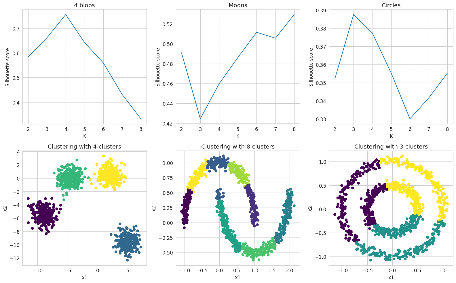
Conclusions:
- The k-means algorithm provides a satisfactory clustering for the dataset with four well-separated blobs, even without knowing the ideal number of clusters in advance, in which case the silhouette coefficient allows to find this ideal number.
- However, despite optimizing the silhouette score, this algorithm does not provide good results for the other datasets, whether for the two nested moons or the two concentric circles.
We will therefore now try another clustering algorithm and test its performance to compare it to k-means. We will limit ourselves to the two datasets for which the k-means algorithm does not work.
DBSCAN (Density-based clustering)
The DBSCAN (Density-Based Spatial Clustering of Applications with Noise) algorithm works in two steps:
- All sufficiently close observations are connected to each other.
- Observations with a minimum number of connected neighbors are considered core samples, from which the clusters are expanded. All observations sufficiently close to a core sample belong to the same cluster as this one.
Documentation: https://scikit-learn.org/stable/modules/generated/sklearn.cluster.DBSCAN.html
The DBSCAN algorithm takes two hyperparameters as input:
eps: the size of the neighborhood, in other words, the distance between two data points below which one point is considered inside the neighborhood of the other.min_samples: the minimum number of neighbors for a data point to be considered a core sample.
### START OF YOUR CODE

# Initialization of the two DBSCAN models
# with hyperparameters eps=0.2, min_samples=2:
dbscan_moons = cluster.DBSCAN(eps=0.2, min_samples=2)
dbscan_circles = cluster.DBSCAN(eps=0.2, min_samples=2)

# Fit to the data
dbscan_moons.fit(moons)
dbscan_circles.fit(circles)

### END OF YOUR CODE
DBSCAN(eps=0.2, min_samples=2)In a Jupyter environment, please rerun this cell to show the HTML representation or trust the notebook.
On GitHub, the HTML representation is unable to render, please try loading this page with nbviewer.org.
DBSCAN(eps=0.2, min_samples=2)
Again, the .labels_ attribute contains, for each observation, the number of the cluster to which this observation has been assigned.
print("Number of labels for the moons dataset:", len(np.unique(dbscan_moons.labels_)))
print("Number of labels for the circles dataset:", len(np.unique(dbscan_circles.labels_)))
Number of labels for the moons dataset: 2
Number of labels for the circles dataset: 2Let’s visualize the clusters obtained:
fig, ax = plt.subplots(1, 2, figsize=(10, 4))

ax[0].scatter(moons[:, 0], moons[:, 1], c=dbscan_moons.labels_, cmap='viridis')
ax[0].set_title("Clustering DBSCAN (eps=0.2)")

ax[1].scatter(circles[:, 0], circles[:, 1], c=dbscan_circles.labels_, cmap='viridis')
ax[1].set_title("Clustering DBSCAN (eps=0.2)");
NoteClick for figure
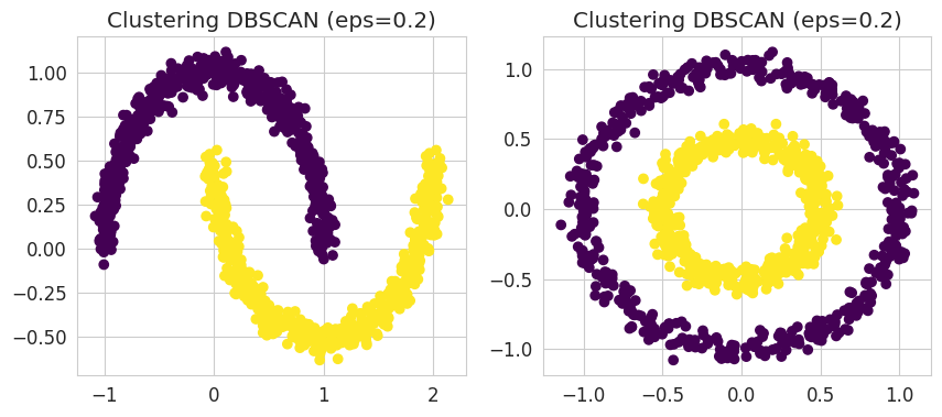
We can see here that the DBSCAN algorithm is able to identify the two respective clusters in the two datasets that were problematic for the k-means algorithm.
We can also note that we did not need to provide a number of clusters beforehand for the algorithm to correctly identify the right number of clusters. However, the algorithm is sensitive to the two hyperparameters mentioned above, which we will now evaluate.
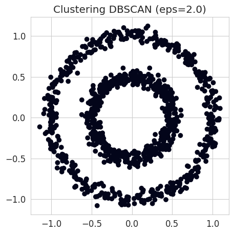
Role of the neighborhood size parameter (eps)
We will assess the influence of the eps parameter on the concentric circles dataset (circles)
### START OF YOUR CODE

# Choose low and high values for eps, for example 0.05 and 2.0
eps_low = 0.05
eps_high = 2.

# Instantiation of a DBSCAN clustering object with low eps and another one with high eps
dbscan_low = cluster.DBSCAN(eps=eps_low, min_samples=2)
dbscan_high = cluster.DBSCAN(eps=eps_high, min_samples=2)

# Fit to the data
dbscan_low.fit(circles)
dbscan_high.fit(circles)

### END OF YOUR CODE
DBSCAN(eps=2.0, min_samples=2)In a Jupyter environment, please rerun this cell to show the HTML representation or trust the notebook.
On GitHub, the HTML representation is unable to render, please try loading this page with nbviewer.org.
DBSCAN(eps=2.0, min_samples=2)
### START OF YOUR CODE

print(np.unique(dbscan_low.labels_))
print(np.unique(dbscan_high.labels_))

### END OF YOUR CODE
[-1 0 1 2 3 4 5 6 7 8 9 10 11 12 13 14 15 16 17 18 19 20 21 22
23 24 25 26 27 28 29 30 31 32 33 34 35 36 37 38 39 40 41 42 43 44 45 46
47 48]
[0]Question: What is the number of clusters obtained in our two models ? (Use the .labels attribute)
fig = plt.figure(figsize=(5, 5))

outliers = np.where(dbscan_low.labels_ == -1)[0]
plt.scatter(circles[outliers, 0], circles[outliers, 1], marker='*', color='red')

non_outliers = np.where(dbscan_low.labels_ != -1)[0]
plt.scatter(circles[non_outliers, 0], circles[non_outliers, 1], c=dbscan_low.labels_[non_outliers])
plt.title(f"Clustering DBSCAN (eps={eps_low})");
NoteClick for figure
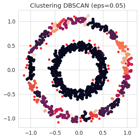
fig = plt.figure(figsize=(5, 5))
plt.scatter(circles[:, 0], circles[:, 1], c=dbscan_high.labels_)
plt.title(f"Clustering DBSCAN (eps={eps_high})");
NoteClick for figure
Find eps with the silhouette coefficient
print("Silhouette coefficient for DBSCAN (eps=0.2) : %.2f" %
      metrics.silhouette_score(circles, dbscan_circles.labels_))
Silhouette coefficient for DBSCAN (eps=0.2) : 0.11eps_values = np.logspace(-3, 1, 40)
silhouettes = []
for eps in eps_values:
dbscan_eps = cluster.DBSCAN(eps=eps, min_samples=2)
dbscan_eps.fit(circles)
if len(np.unique(dbscan_eps.labels_)) > 1: # Needed to compute the silhouette coeff
silhouettes.append(metrics.silhouette_score(circles, dbscan_eps.labels_))
else:
silhouettes.append(-1)plt.plot(eps_values, silhouettes)
plt.xscale("log")
plt.xlabel("eps (log scale)")
plt.ylabel("silhouette");
NoteClick for figure
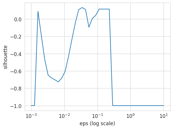
best_silhouette = np.max(silhouettes)
print(f"Optimal silhouette coefficient: {best_silhouette:.2f}")
print(f"Corresponding eps: {eps_values[silhouettes.index(best_silhouette)]:.2f}")
Optimal silhouette coefficient: 0.13
Corresponding eps: 0.03Let’s see what the clustering looks like using the eps parameter yielding the best silhouette coefficient:
best_eps = eps_values[silhouettes.index(best_silhouette)]

dbscan_best = cluster.DBSCAN(eps=best_eps, min_samples=2)
dbscan_best.fit(circles)

fig = plt.figure(figsize=(5, 5))
plt.scatter(circles[:, 0], circles[:, 1], c=dbscan_best.labels_)
plt.title(f"Clustering DBSCAN (eps={best_eps:.2f})");
NoteClick for figure
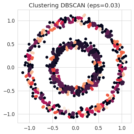
Question:
- What is the problem here ?
- Is the silhouette coefficient adapted to our dataset ?
Adjusted Rand Index
The adjusted Rand index enables to compare a clustering’s result with labels. For each pair of observations, we look at whether they belong to the same cluster or not, in the predicted and the true clustering. The index takes values between 0 (random clustering) and 1 (perfect clustering).
Documentation : https://scikit-learn.org/stable/modules/generated/sklearn.metrics.adjusted_rand_score.html
Question: Why not use an evaluation metric from classification models here ?
print("Adjusted Rand Index of K-means (K=2) : %.2f" % metrics.adjusted_rand_score(circles_labels, kmeans_circles.labels_))Adjusted Rand Index of K-means (K=2) : -0.00print("Adjusted Rand Index of DBSCAN (eps=0.2) : %.2f" % metrics.adjusted_rand_score(circles_labels, dbscan_circles.labels_))Adjusted Rand Index of DBSCAN (eps=0.2) : 1.00Conclusion
This notebook provided a comprehensive exploration of unsupervised learning techniques for dimensionality reduction and clustering.
We began with Principal Components Analysis (PCA), applying it first to the Decathlon dataset to understand variance explanation, project data into lower dimensions, and interpret the meaning of principal components in terms of event performance. We then used PCA on the Olivetti faces dataset, visualizing the resulting 2D projections and interpreting the pixel contributions to the principal components as ‘eigenfaces’. We also briefly introduced t-Distributed Stochastic Neighbor Embedding (t-SNE) as an alternative for visualizing high-dimensional data, noting its ability to better separate classes and the influence of the ‘perplexity’ parameter.
Next, we delved into Clustering Algorithms using synthetically generated datasets (blobs, moons, circles):
- We manually implemented the K-means algorithm step-by-step to understand its iterative process of centroid assignment and recalculation. We then used
sklearn’s implementation, demonstrating its effectiveness on globular clusters (like the 4 blobs) but highlighting its limitations with non-convex or irregularly shaped clusters (like moons and circles). - We explored the silhouette coefficient as a metric to evaluate clustering performance and select the optimal number of clusters (
k). We observed its effectiveness for well-separated, globular clusters but also discussed its shortcomings when dealing with complex cluster geometries where points from different clusters might be geometrically close. - We then introduced DBSCAN (Density-Based Spatial Clustering of Applications with Noise), showcasing its ability to correctly identify non-convex clusters, such as the ‘moons’ and ‘circles’ datasets, where K-means struggled. We investigated the influence of its
epsparameter and further discussed the limitations of the silhouette coefficient in evaluating DBSCAN on such datasets. - Finally, we learned about the Adjusted Rand Index (ARI), a robust metric for comparing clustering results against known ground truth labels. We specifically highlighted why traditional classification metrics are unsuitable for clustering due to the arbitrary nature of cluster labels and the unsupervised nature of the task, reinforcing the need for metrics like ARI for a fair comparison.
Bonus: Clustering on Penguins
The goal here is to test several unsupervised clustering methods on a new dataset, and to compare them. Try the methods seen above such as sklearn.cluster.KMeans or sklearn.cluster.DBSCAN. You can also try other methods such as Gaussian mixtures (sklearn.mixture.GaussianMixture).
Which methods do you think should work better? Why?
The dataset we suggest you use here concerns different species of penguins and some physical characteristics. The 3 species are: Adelie penguins, Gentoo penguins and Chinstrap penguins.
!wget https://raw.githubusercontent.com/CBIO-mines/fml-dassault-systems-en/main/data/penguins_data.csv

palmerpenguins = pd.read_csv("penguins_data.csv")
--2026-05-13 09:40:45-- https://raw.githubusercontent.com/CBIO-mines/fml-dassault-systems-en/main/data/penguins_data.csv
Resolving raw.githubusercontent.com (raw.githubusercontent.com)... 185.199.110.133, 185.199.108.133, 185.199.109.133, ...
Connecting to raw.githubusercontent.com (raw.githubusercontent.com)|185.199.110.133|:443... connected.
HTTP request sent, awaiting response... 200 OK
Length: 27561 (27K) [text/plain]
Saving to: ‘penguins_data.csv.1’
penguins_data.csv.1 100%[===================>] 26.92K --.-KB/s in 0s
2026-05-13 09:40:45 (132 MB/s) - ‘penguins_data.csv.1’ saved [27561/27561]
Alternatively: If you already downloaded the data, uncomment the following line:
# palmerpenguins = pd.read_csv("data/penguins_data.csv")palmerpenguins.head()| species | label | island | bill_length_mm | bill_depth_mm | flipper_length_mm | body_mass_g | sex | |
|---|---|---|---|---|---|---|---|---|
| 0 | Adelie Penguin (Pygoscelis adeliae) | adelie | Torgersen | 39.1 | 18.7 | 181.0 | 3750.0 | MALE |
| 1 | Adelie Penguin (Pygoscelis adeliae) | adelie | Torgersen | 39.5 | 17.4 | 186.0 | 3800.0 | FEMALE |
| 2 | Adelie Penguin (Pygoscelis adeliae) | adelie | Torgersen | 40.3 | 18.0 | 195.0 | 3250.0 | FEMALE |
| 3 | Adelie Penguin (Pygoscelis adeliae) | adelie | Torgersen | NaN | NaN | NaN | NaN | NaN |
| 4 | Adelie Penguin (Pygoscelis adeliae) | adelie | Torgersen | 36.7 | 19.3 | 193.0 | 3450.0 | FEMALE |
The first step is to filter some data to avoid missing values (NA or NaN).
palmerpenguins = palmerpenguins[palmerpenguins['bill_depth_mm'].notna()]
palmerpenguins = palmerpenguins.reset_index(drop=True)
We will focus only on two characteristics of our penguins: beak length and body mass
penguins_X = np.array(palmerpenguins[["bill_length_mm", "body_mass_g"]])from sklearn import preprocessingOur variables have very different scales, as we can see in the data displayed above. Therefore, we need to standardize our data.
# Standardization (centering and scaling)
penguins_X = preprocessing.StandardScaler().fit_transform(penguins_X)
species_names, species_int = np.unique(palmerpenguins.species, return_inverse=True)
penguins_labels = species_int
species_namesarray(['Adelie Penguin (Pygoscelis adeliae)',
'Chinstrap penguin (Pygoscelis antarctica)',
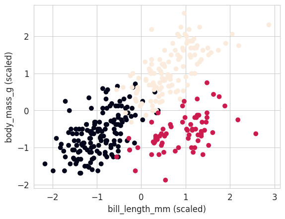
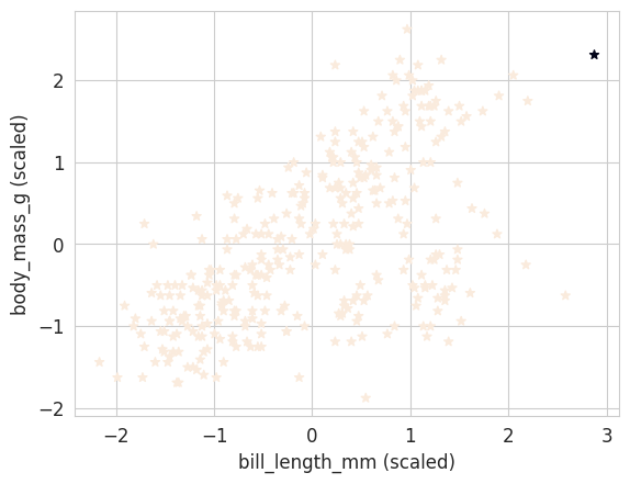
'Gentoo penguin (Pygoscelis papua)'], dtype=object)Let’s first visualize our data on a graph:
plt.scatter(penguins_X[:, 0], penguins_X[:, 1], c=penguins_labels)
plt.xlabel("bill_length_mm (scaled)")
plt.ylabel("body_mass_g (scaled)");
NoteClick for figure
It’s now up to you to test different clustering algorithms on these data, and evaluate their performance. Will you be able to obtain a perfect clustering ?
In addition to the clustering algorithms used above, you can try Gaussian mixtures (GaussianMixture) for example, or other methods from the cluster or mixture modules. For each, provide the silhouette coefficients and adjusted Rand indices you obtain, as well as a visualization of the resulting clustering.
KMeans
# Initialization of a k-means model with k=3
kmeans = cluster.KMeans(n_clusters=3)

# Fit to the data
kmeans.fit(penguins_X)KMeans(n_clusters=3)In a Jupyter environment, please rerun this cell to show the HTML representation or trust the notebook.
On GitHub, the HTML representation is unable to render, please try loading this page with nbviewer.org.
KMeans(n_clusters=3)
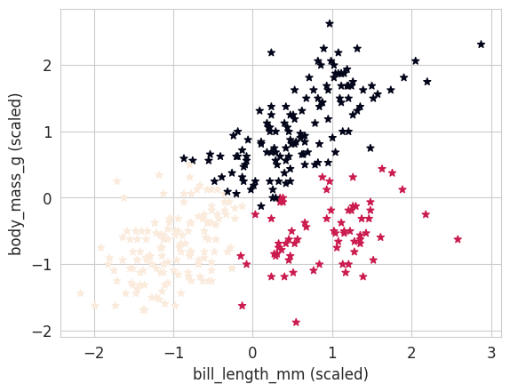
# plt.scatter(penguins_X[:, 0], penguins_X[:, 1], c=penguins_labels, marker='o')
plt.scatter(penguins_X[:, 0], penguins_X[:, 1], c=kmeans.labels_, marker='*')


plt.xlabel("bill_length_mm (scaled)")
plt.ylabel("body_mass_g (scaled)");
NoteClick for figure
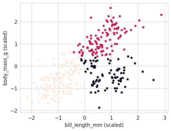
print("Silhouette coefficient for k-means (k=3) : %.2f" % metrics.silhouette_score(penguins_X, kmeans.labels_))Silhouette coefficient for k-means (k=3) : 0.47print("Adjusted Rand Index for K-means (K=3) : %.2f" % metrics.adjusted_rand_score(penguins_labels, kmeans.labels_))Adjusted Rand Index for K-means (K=3) : 0.76DBSCAN
eps_values = np.logspace(-3, 1, 40)
silhouettes = []

for eps in eps_values:
    dbscan_eps = cluster.DBSCAN(eps=eps, min_samples=2)
    dbscan_eps.fit(penguins_X)
    if len(np.unique(dbscan_eps.labels_)) > 1: # needed to compute silhouette coeff
        silhouettes.append(metrics.silhouette_score(penguins_X, dbscan_eps.labels_))
    else:
        silhouettes.append(-1)
plt.plot(eps_values, silhouettes)
plt.xscale("log")
plt.xlabel("eps (log scale)")
plt.ylabel("silhouette");
NoteClick for figure
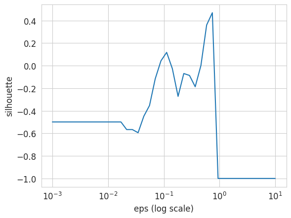
best_silhouette = np.max(silhouettes)
print("Optimal silhouette coefficient: %.2f" % best_silhouette)
best_eps = eps_values[silhouettes.index(best_silhouette)]
print("Corresponding eps: %.2f" % best_eps)
Optimal silhouette coefficient: 0.47
Corresponding eps: 0.74dbscan_opt = cluster.DBSCAN(eps=best_eps, min_samples=2)
dbscan_opt.fit(penguins_X)DBSCAN(eps=np.float64(0.7443803013251689), min_samples=2)In a Jupyter environment, please rerun this cell to show the HTML representation or trust the notebook.
On GitHub, the HTML representation is unable to render, please try loading this page with nbviewer.org.
DBSCAN(eps=np.float64(0.7443803013251689), min_samples=2)
np.unique(dbscan_opt.labels_)array([-1, 0])print("Adjusted Rand Index for DBSCAN : %.2f" % metrics.adjusted_rand_score(penguins_labels, dbscan_opt.labels_))Adjusted Rand Index for DBSCAN : 0.00#plt.scatter(penguins_X[:, 0], penguins_X[:, 1], c=penguins_labels, marker='o')
plt.scatter(penguins_X[:, 0], penguins_X[:, 1], c=dbscan_opt.labels_, marker='*')
plt.xlabel("bill_length_mm (scaled)")
plt.ylabel("body_mass_g (scaled)");
NoteClick for figure
Gaussian mixture model
The Gaussian Mixture Model optimizes the parameters of a finite number of Gaussians to fit the data.
Documentation : https://scikit-learn.org/stable/modules/generated/sklearn.mixture.GaussianMixture.html
from sklearn import mixture# Initialization of Gaussian Mixture model with 3 components
gmm = mixture.GaussianMixture(n_components=3)
# Fit to the data
gmm.fit(penguins_X)
# Clusters prediction
gmm_labels = gmm.predict(penguins_X)#plt.scatter(penguins_X[:, 0], penguins_X[:, 1], c=penguins_labels, marker='o')
plt.scatter(penguins_X[:, 0], penguins_X[:, 1], c=gmm_labels, marker='*')
plt.xlabel("bill_length_mm (scaled)")
plt.ylabel("body_mass_g (scaled)");
NoteClick for figure
print("Silhouette coefficient for GMM (k=3) : %.2f" % metrics.silhouette_score(penguins_X, gmm_labels))Silhouette coefficient for GMM (k=3) : 0.47print("Adjusted Rand Index for GMM (K=3) : %.2f" % metrics.adjusted_rand_score(penguins_labels, gmm_labels))Adjusted Rand Index for GMM (K=3) : 0.79